Introduction
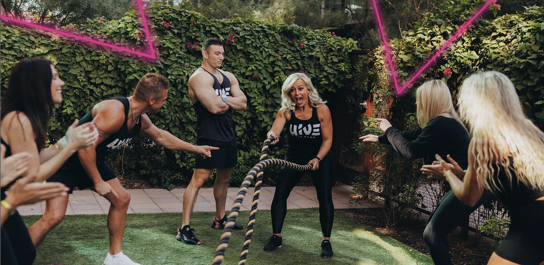
After experiencing great success as health coaches, Doug and Thea Wood were on a mission to chase better and began expanding their reach to impact others for the Kingdom through books, podcasts, global education, and more. A trip to a European spa in 2018 led to an idea they couldn’t ignore. What would it look like to have an all-inclusive fitness and healing experience that encouraged community and the healing of mind, body, and spirit?
The Challenge
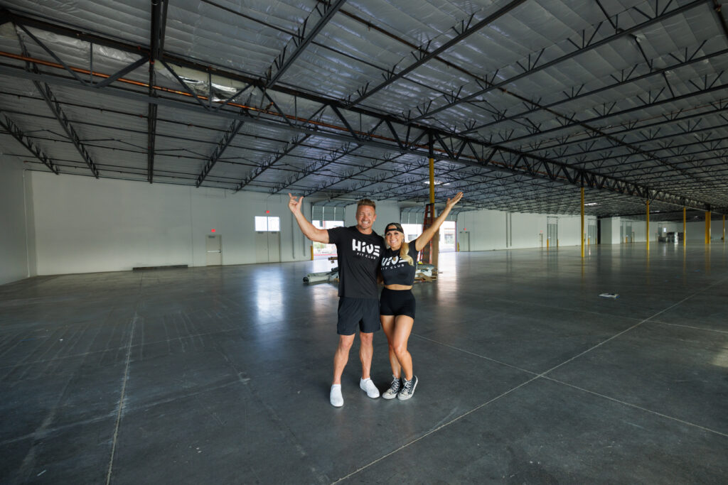
Looking to revolutionize the typical gym experience into something more, they had a few challenges ahead in order to bring their idea to life. The first challenge was merging the founder’s ideas with customer needs to create a world-class, all-inclusive health experience, all-in-one space. Secondly, like any emerging brand, The Hive Fit Club needed to effectively communicate what it is, how it’s different, and why it should be a part of their ideal customer’s daily life.
Finally, Hive had their sights set on future expansion across the United States so the brand needed to compete on a national level and have a brand system to make adding locations easy while upholding consistency.

The Solutions
The Good Kids never shy away from a big challenge so we were ready to find a brand system that would propel Hive towards massive impact across the lives of so many. Using everything we learned through the research and discovery, we began by identifying the brand’s personality and ideated possible visuals that would capture the spirit of the brand to come. Ultimately, a brand idea of “relentless growth” was established, alongside five key attributes to be the guiding force behind the creative work to come.
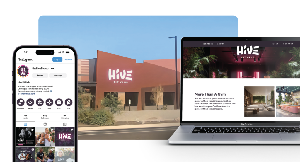
With the direction in hand, it was time to craft a visual identity system that would stand out and get noticed while emotionally resonating with their target audience. Introducing Hive Fit Club: More than a gym, it’s an experience.
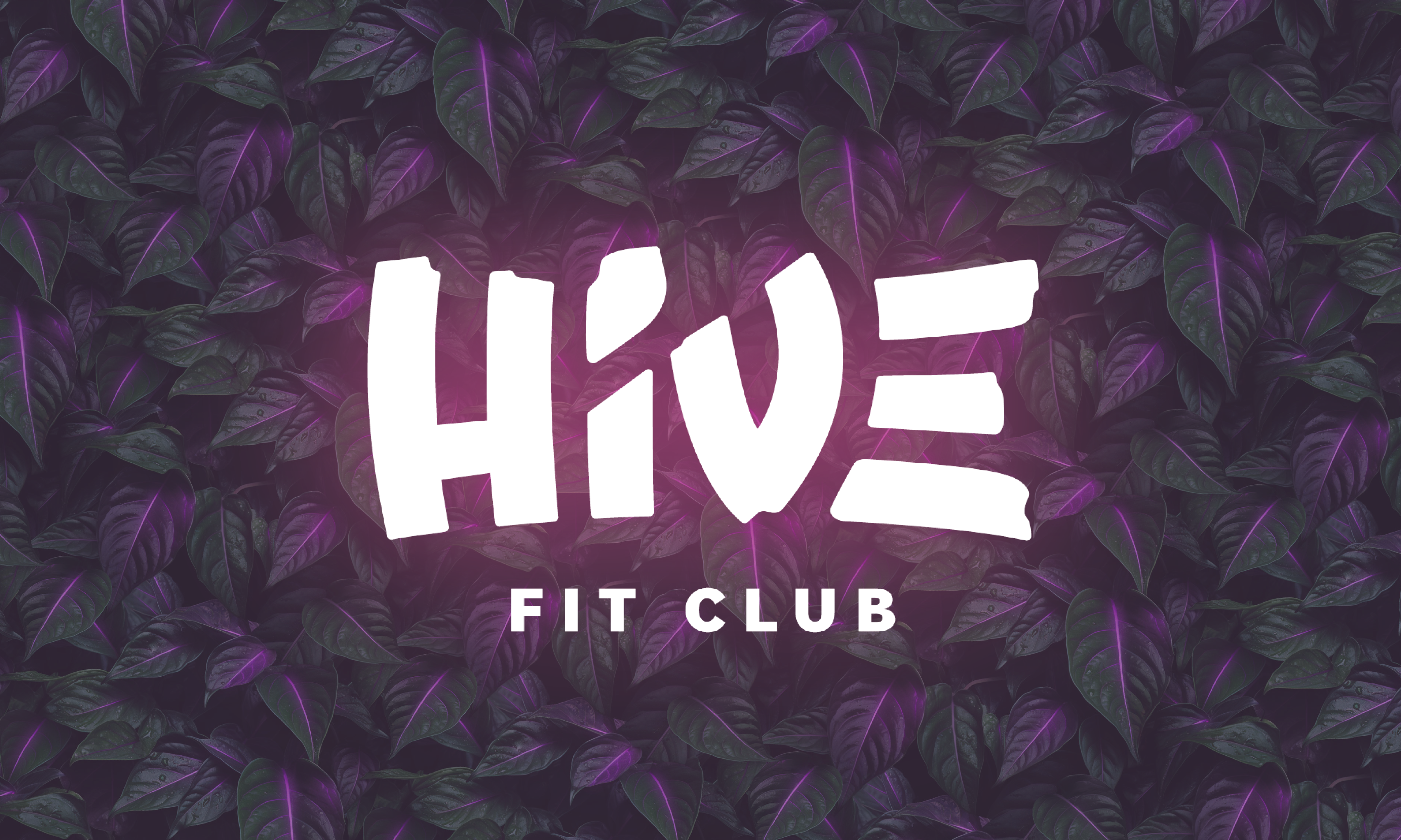
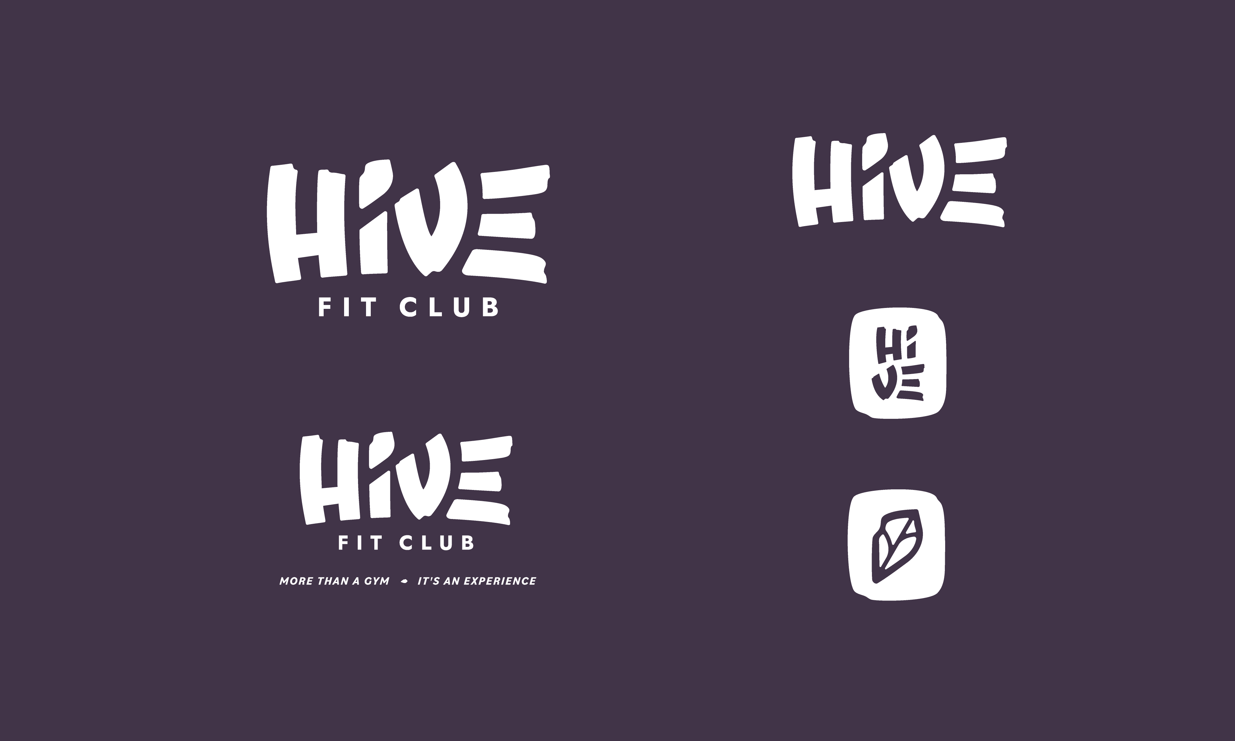
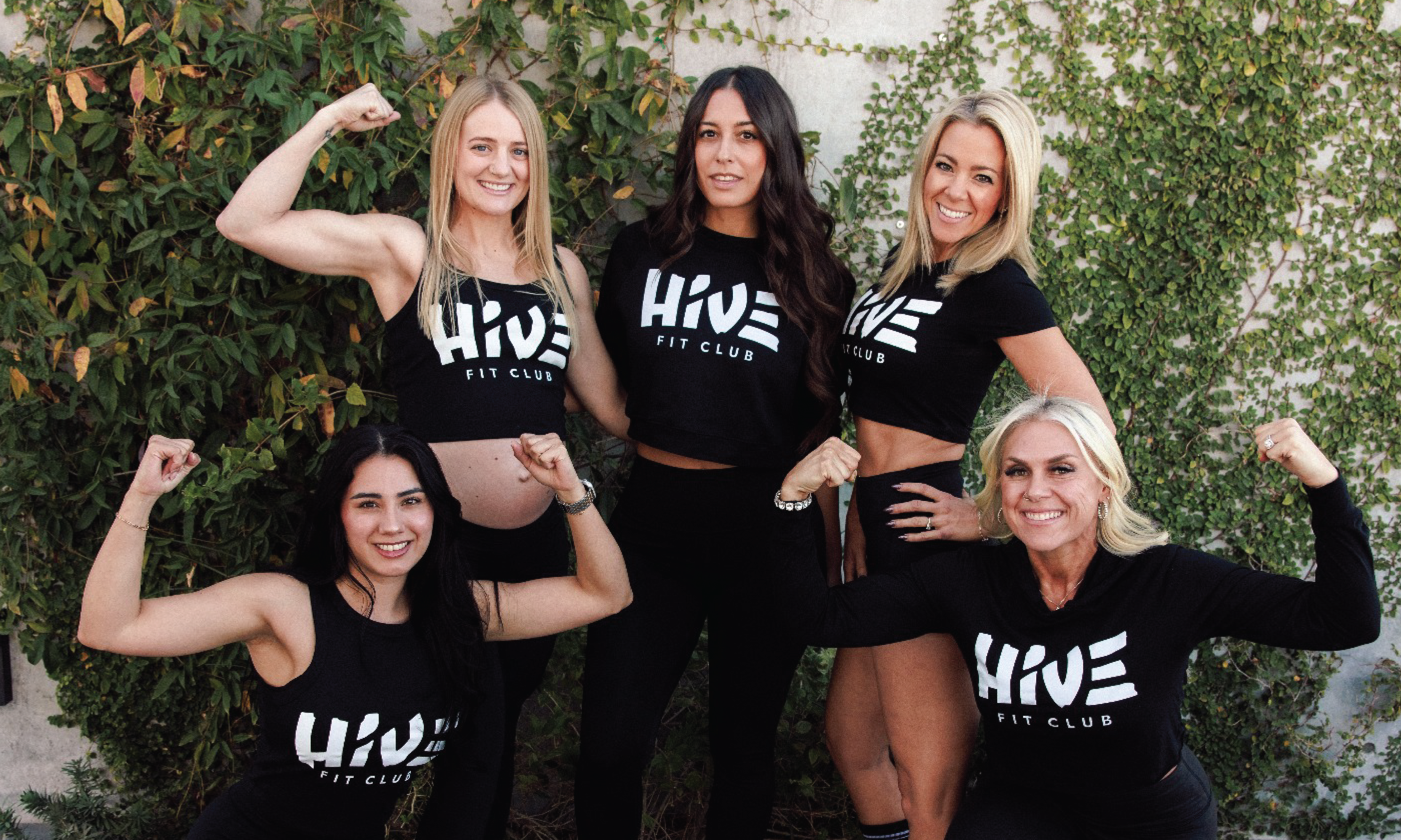
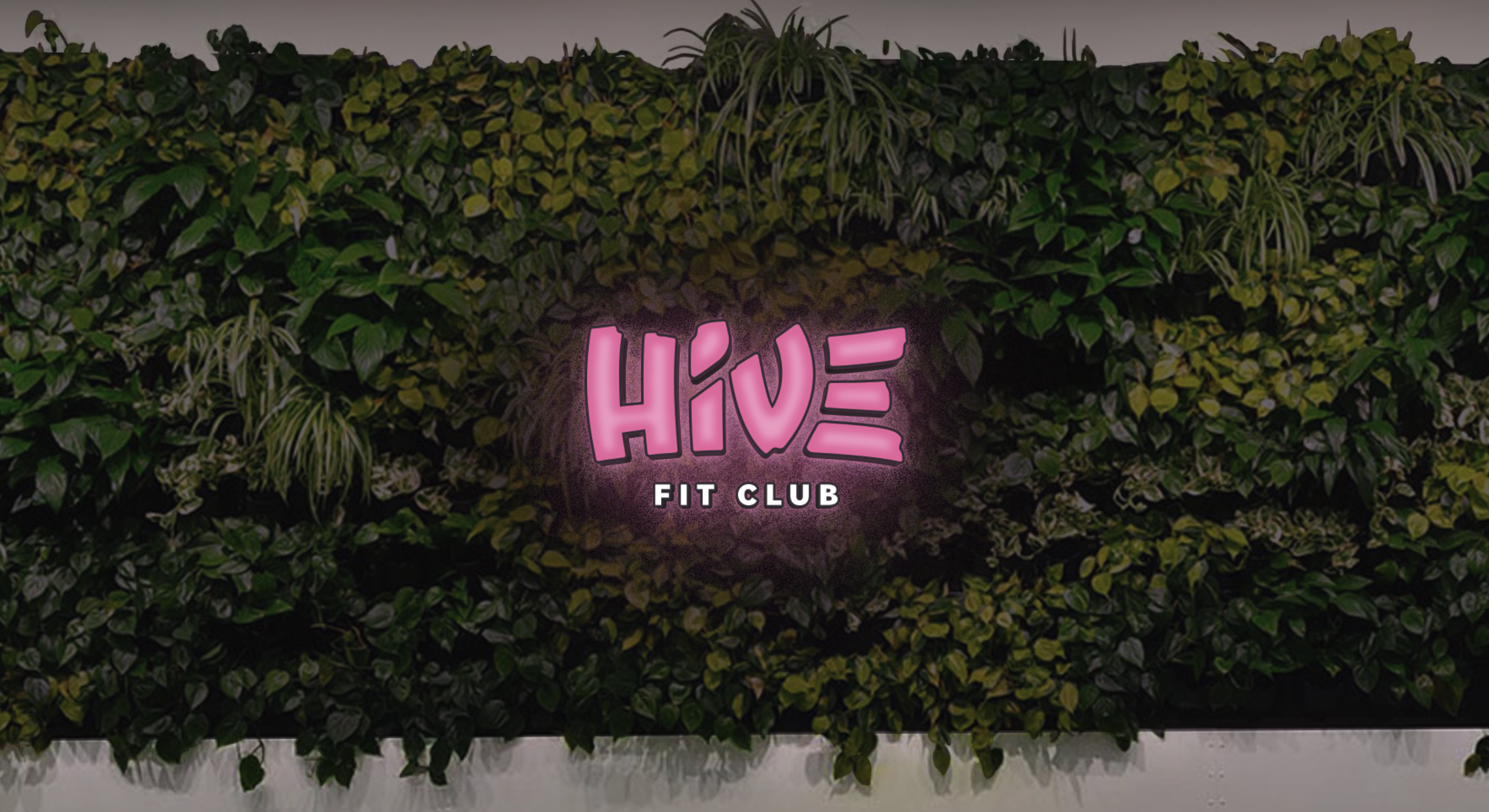
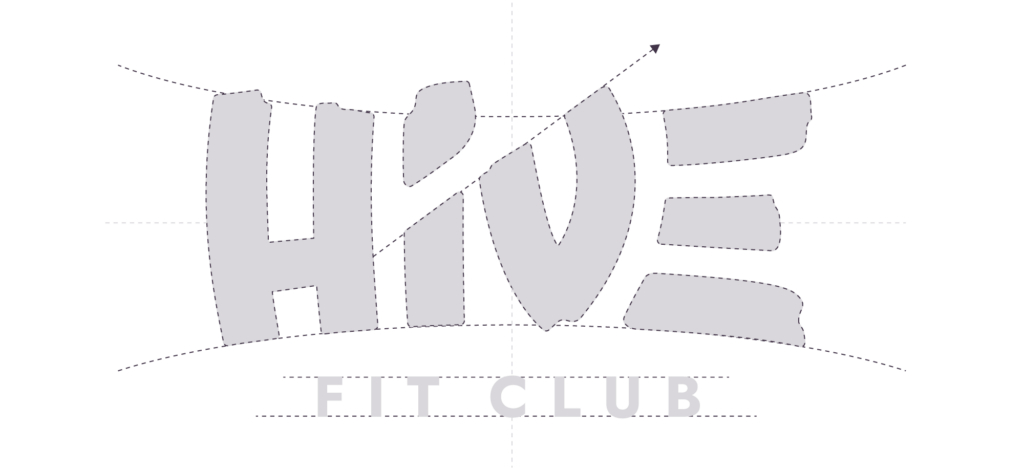
Inspired by the wild yet healing qualities of the jungle, the Hive logo was handlettered to show its authenticity while remaining personable. The “i” also features the shape of a leaf to draw greater connection to nature. The upward line among the “iv” represents growth and forward momentum that each guest will experience at The Hive, alongside an “e” that consists of three lines that represent leveling up your health. Finally, the rough edges are both earthy and wholesome, striking a perfect balance.
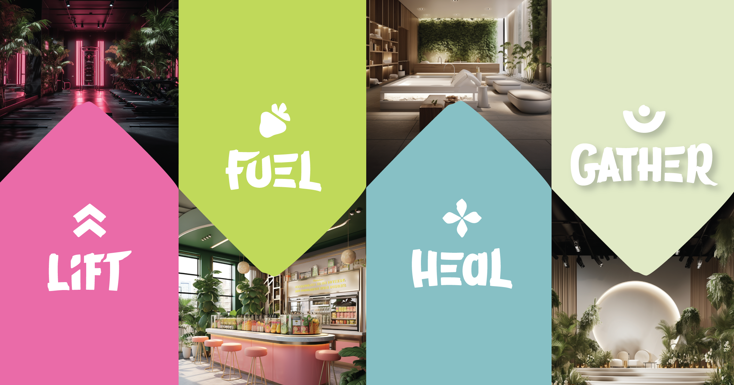
Now it was time to add hierarchy within the logo system so members could build community around each space within the building. From the gym to the juice bar, we identified key words that go beyond labeling the space and instead inspire others how to activate the space. From beginning to end, Hive is about taking action.
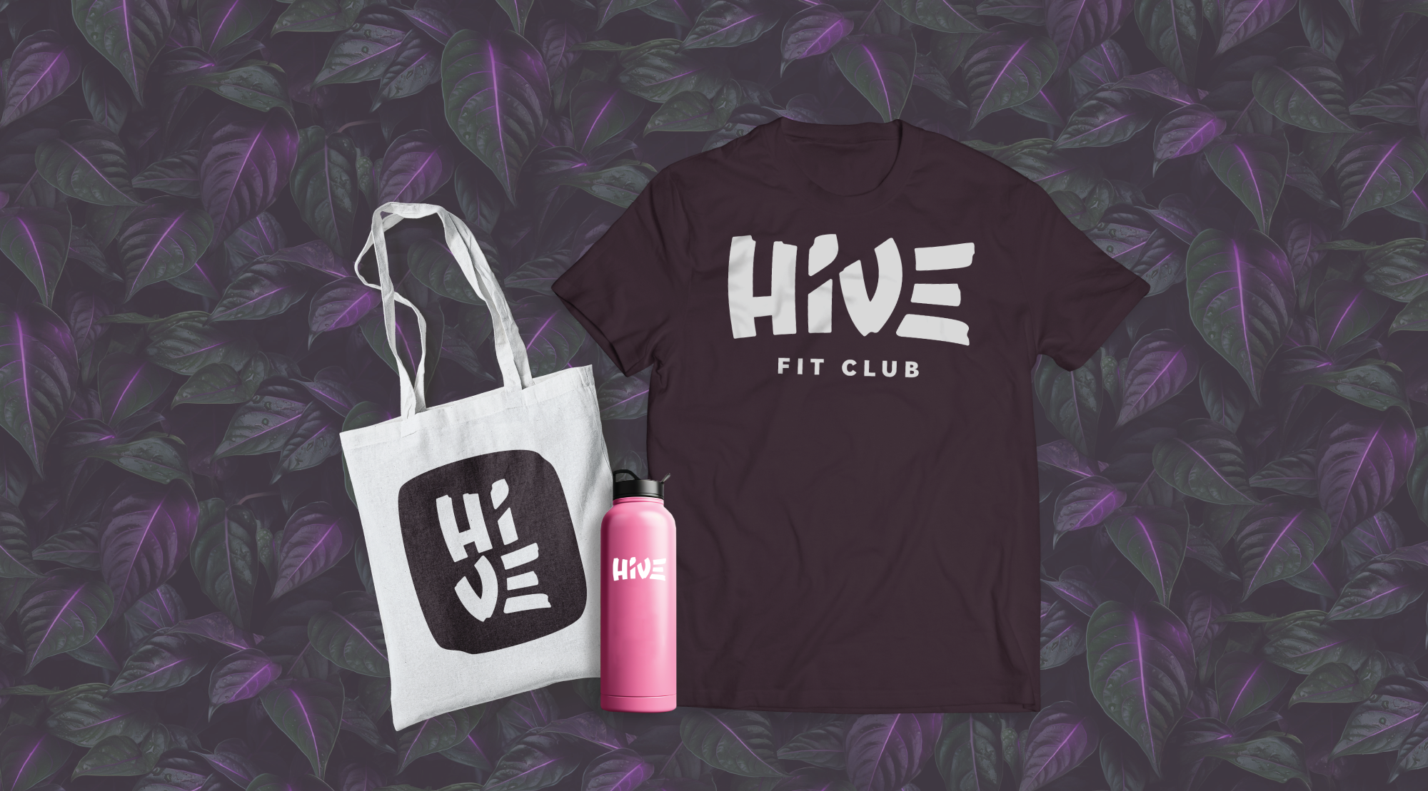
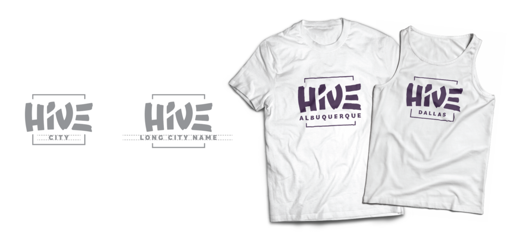
Lastly, to assist with their future growth across the country, The Good Kids created a dynamic logo system that would feature the city’s name within the logo for customizable merch across the various locations. Now each community can proudly represent Hive Fit Club!
The Results
Today, Hive Fit Club is growing every day with a community ready and excited to experience this new, all-inclusive health experience. The groundbreaking facility is under construction in Scottsdale, Arizona and will open this year! You can sign up to get early access here. We eagerly await to see this award-winning brand in action
