Introduction
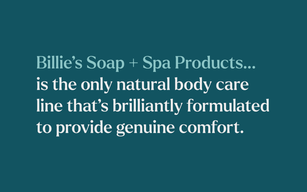
Billie’s Soap + Spa Products is the result of one woman’s lifelong journey of curiosity and care. Billie, the company’s founder, utilized her biochemistry background to develop a natural, nourishing scrub that moisturizes for up to 36 hours. Today, Billie’s Soap continues to offer innovative, natural products designed to provide genuine comfort and care to every individual.
The Challenge
Despite a loyal local following, Billie’s Soap products lacked brand awareness on a national level. To achieve the next phase of business growth, Billie’s aimed to create a brand and package design worthy of the national stage.

Start a Project with Us
Let’s collaborate on the next big thing together.
The Solutions
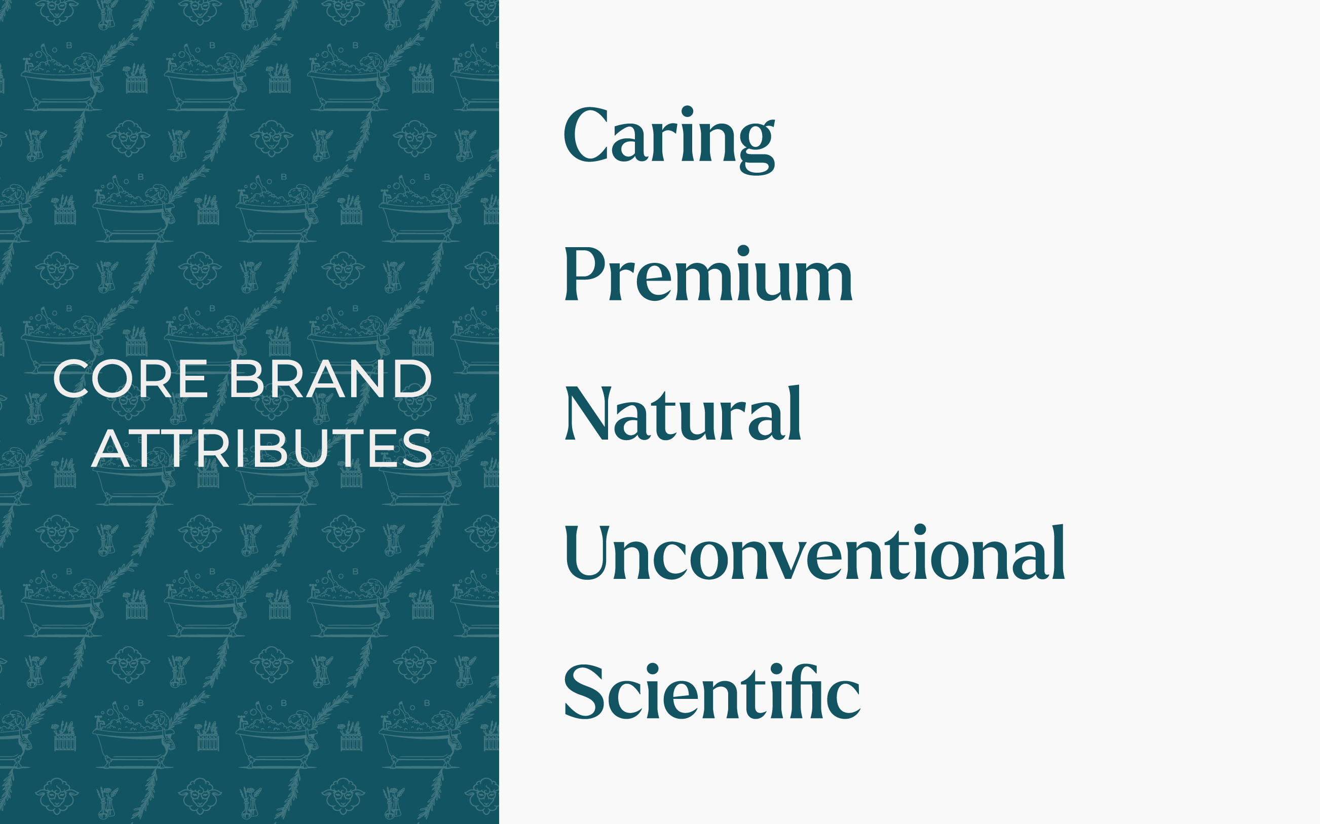
Our approach began with a comprehensive strategy phase. We developed a blueprint that captured Billie’s brand personality, consumer insights, and competitive landscape. This process revealed five core brand attributes: Caring, Premium, Natural, Unconventional, and Scientific.


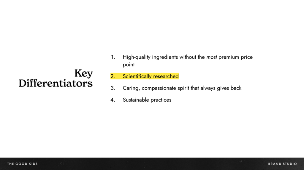
An important discovery during this phase was Billie’s unique position in the market. Unlike many other body care products, Billie’s formulas are rooted in scientific principles, setting them apart amongst the crowded bodycare products on shelves.
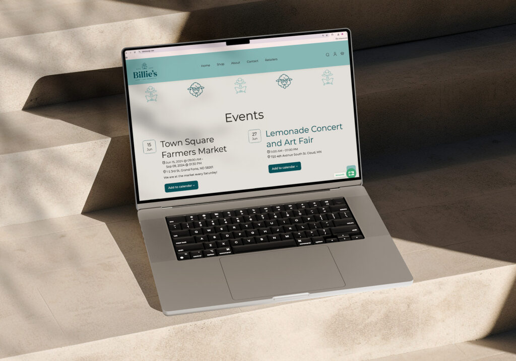
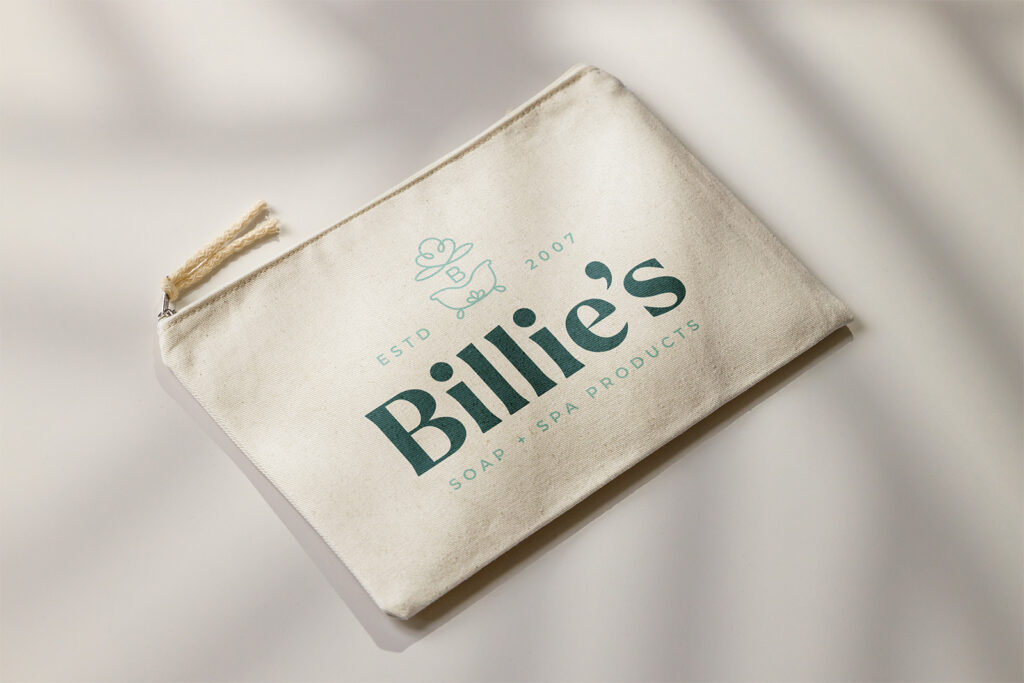
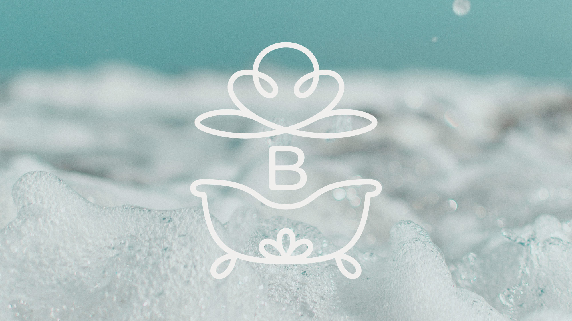
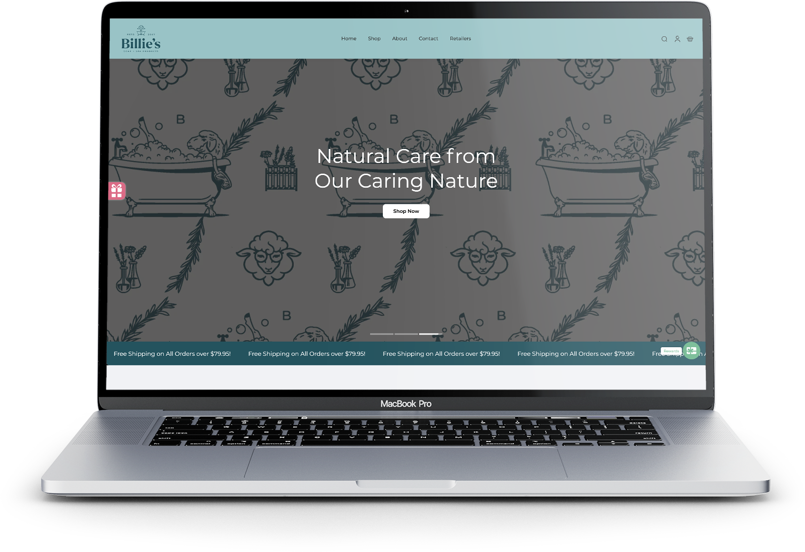
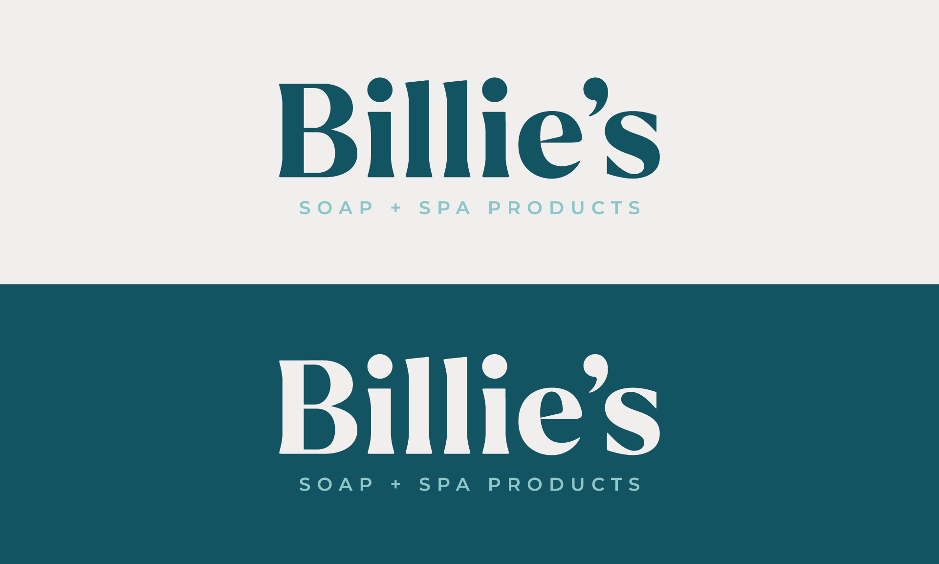
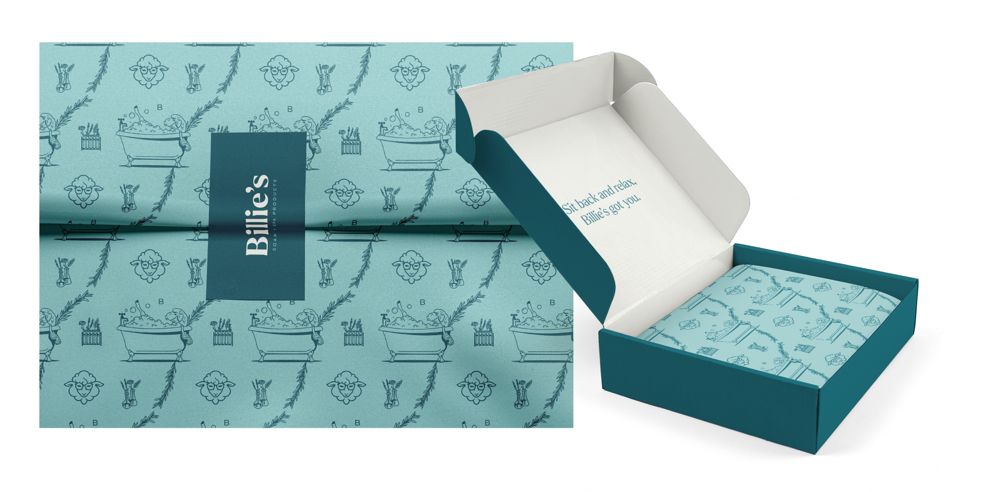
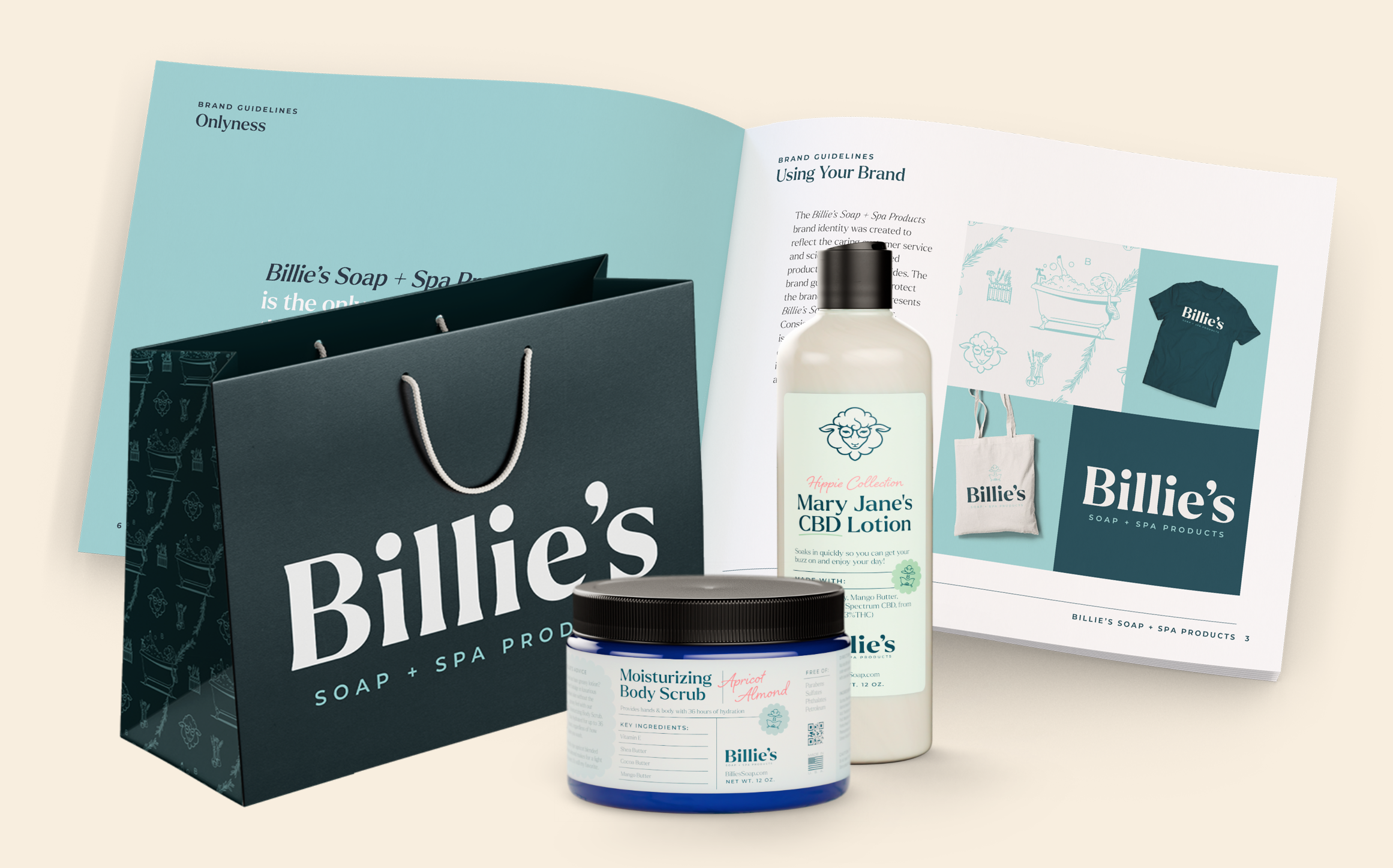
The design phase focused on elevating Billie’s visual brand to reflect its scientific nature while maintaining its caring essence. We refined Billie’s long-standing sheep mascot, adding goggles to emphasize the brand’s scientific credibility, while giving it some character. The classic bathtub icon was reimagined with a more sophisticated look, aligning with the brand’s premium brand attribute.


To complement these elements, we also created a distinct pattern incorporating brand elements and illustrations as a finishing touch. This versatile design can be applied across various touchpoints, from packaging to web design.
With the complete brand established, we turned our attention to packaging, beginning with Billie’s best-selling scrub. The original label, while effective, was lacking brand touches. The newly-designed label is easy for the eyes to scan, allowing consumers to quickly take in key ingredients and product highlights. It also features a note from Billie herself, adding in a personal touch that’s true to the brand ethos.
Next up was Billie’s lotion that is near and dear to many peoples’ hearts. Mary Jane’s CBD Lotion, which Billie’s Soap’s provides free-of-charge to cancer patients, needed a new look. The label needed to feature more than twenty ingredients, so legibility and visual interest was at this project’s core. We incorporated green shades to represent the product’s inclusion in the Hippie Collection. Of course, Billie’s iconic brand assets including the sheep and bathtub were featured as well.


The Results
Billie’s Soaps went from a humble beginning, to becoming a thriving company offering genuine care and comfort through their innovative products. Their journey is proof that with the right blend of brains, heart, and the right brand strategy, you can thrive in a national market.
Whether you’re a soap aficionado, a science buff, or just someone who appreciates 36 hours of silky-smooth skin, keep your eyes peeled for Billie’s Soap + Spa Products, coming soon to a retailer near you!