Introduction
Hey dads, this one’s for you!
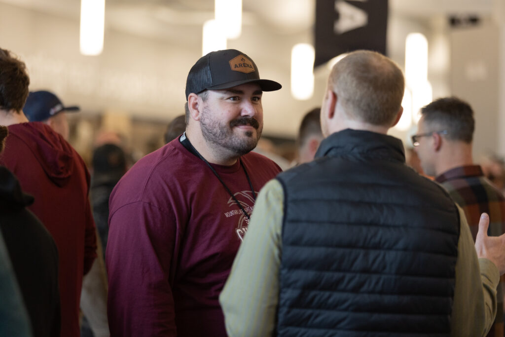
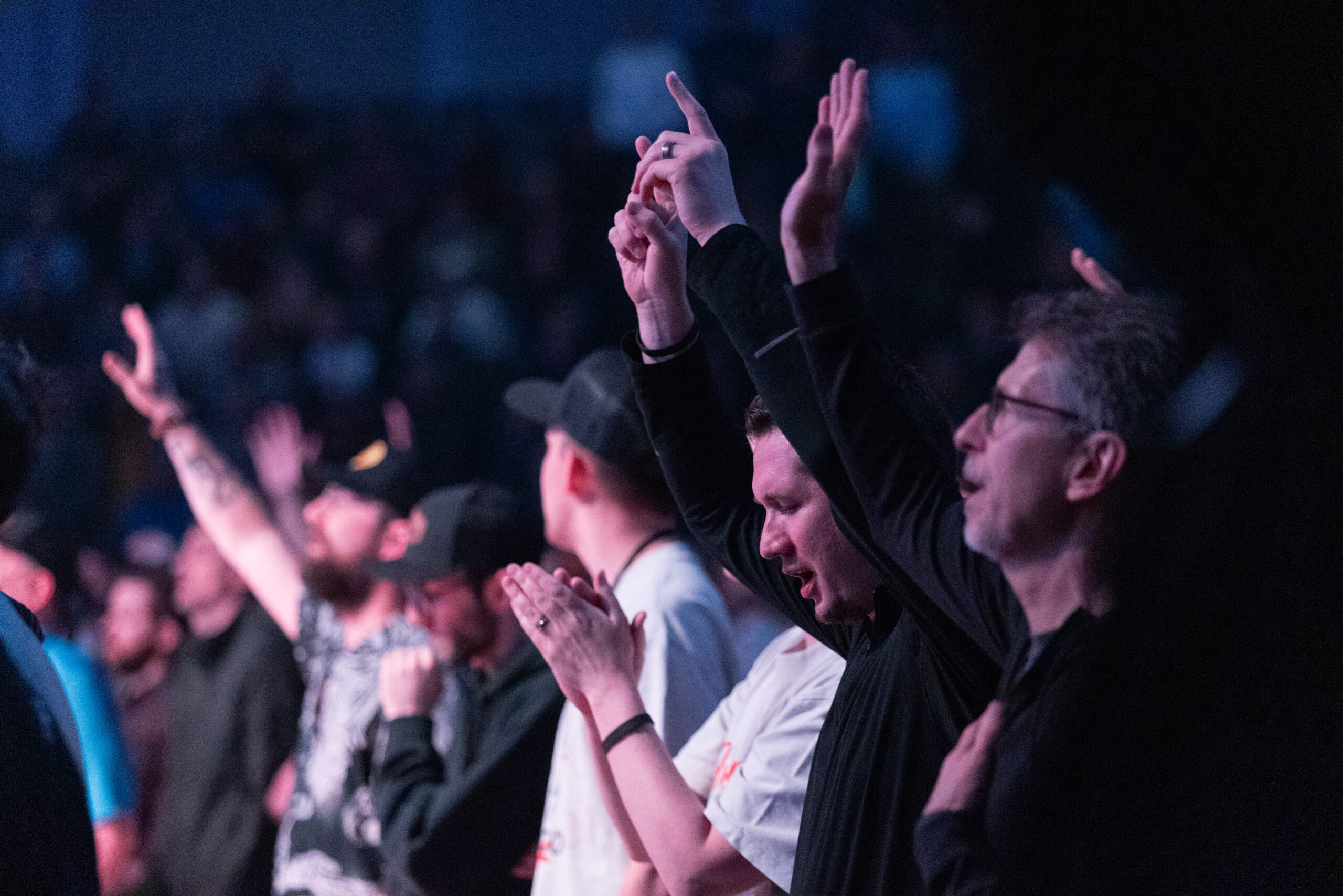
If you haven’t heard of The Arena, you’re in for a treat. Imagine a group of fellow fathers trading in their recliners for real talk, swapping dad jokes for deep connections, and turning a typical weekend into a life-changing experience.
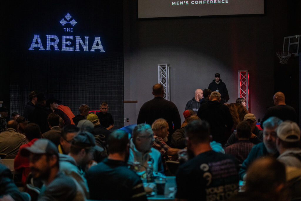
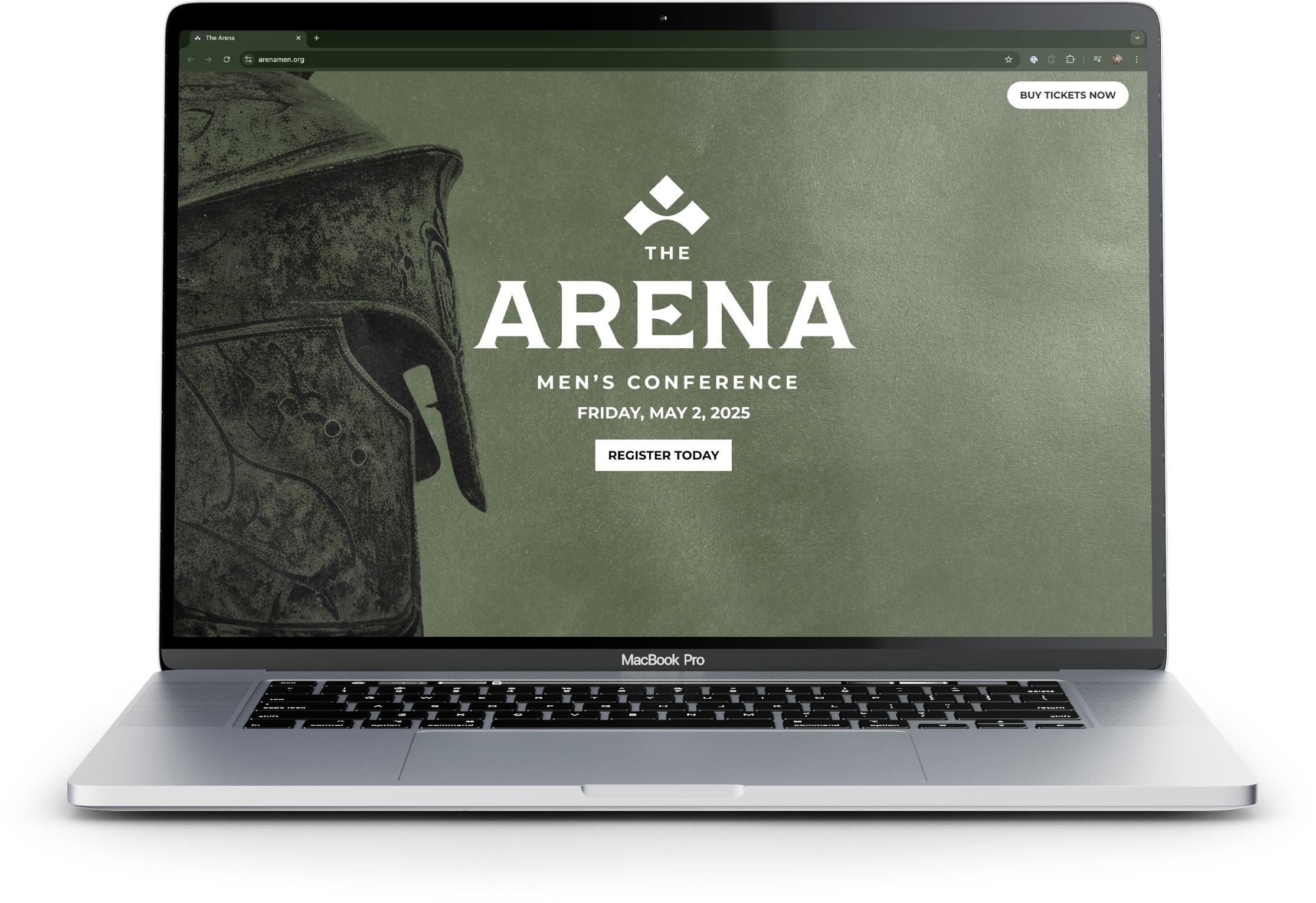
Welcome to The Arena. It’s not your average church conference – it’s a high-octane, faith-fueled conference for men who want to level up in life, love, and faith. Hosted by Evangel, a church with a knack for thinking outside the box, The Arena is making waves in North Dakota. The conference aims to create a community for family men, helping them become better husbands, fathers, friends, and followers of God.

The Challenge
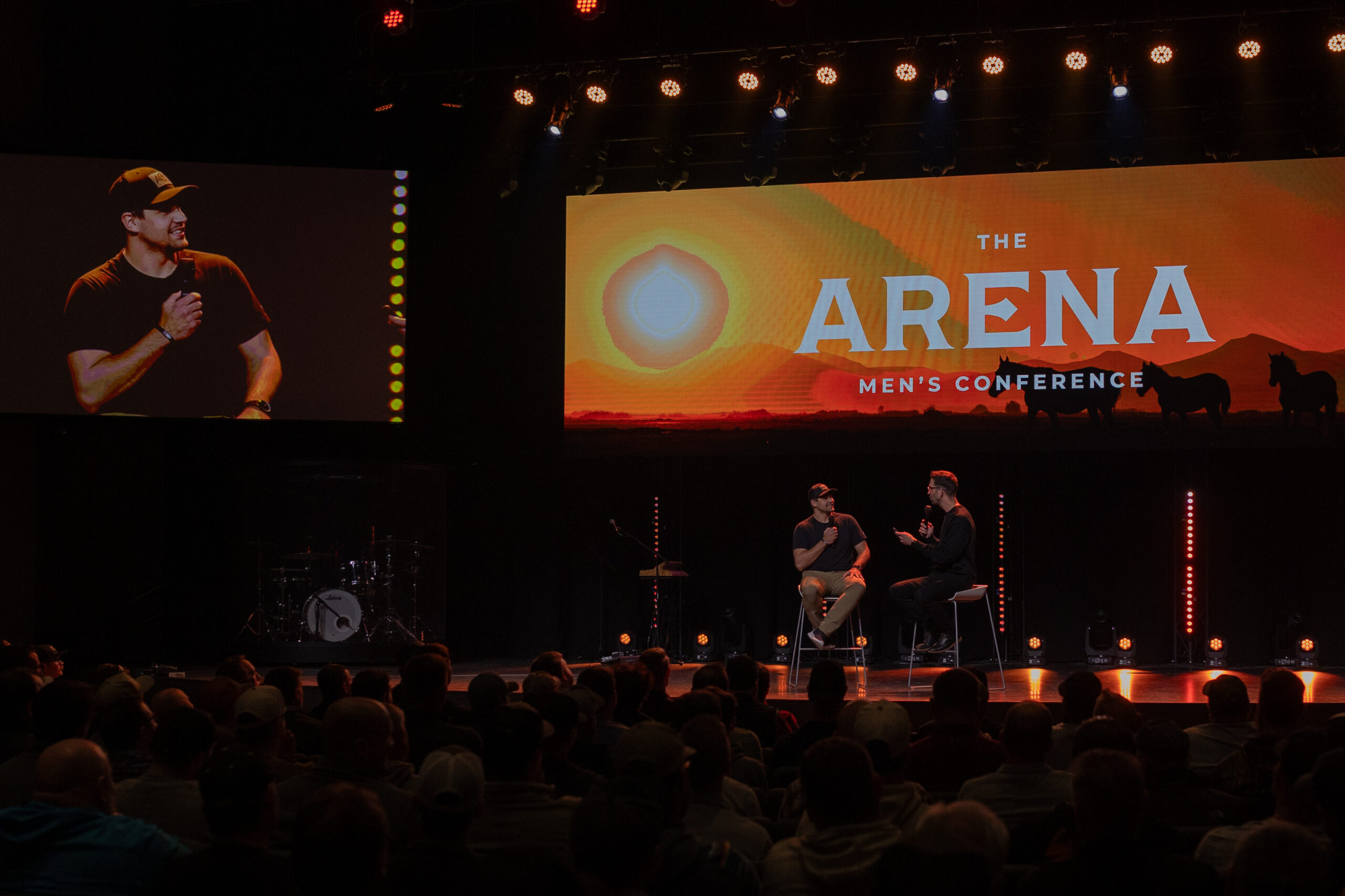
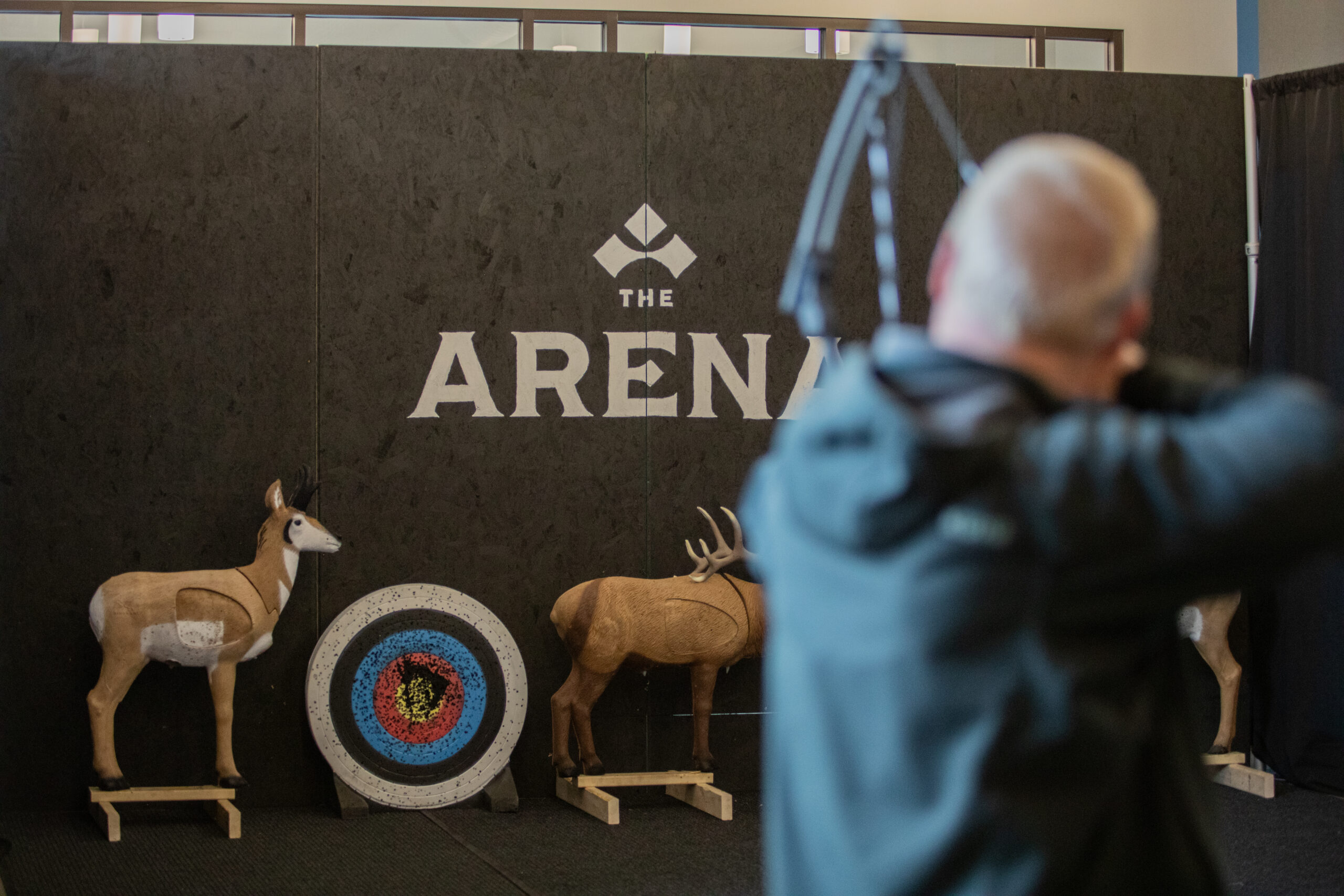
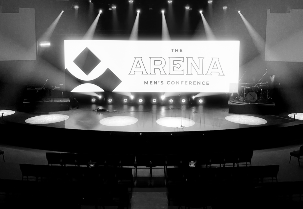
Evangel struck gold with The Arena concept (inspired by Teddy Roosevelt’s famous quote), but they needed visuals to match. The church recognized that a strong, cohesive visual brand was crucial to attract their target audience of family men within a 3-hour radius of Bismarck, North Dakota. They needed an icon and wordmark that would work seamlessly across multiple uses like a stage backdrop, slide decks, merch, and more.
Additionally, The Arena isn’t a one-and-done event. It’s an annual conference, with each year bringing a fresh theme to the table. This meant the design had to be adaptable – strong enough to stand on its own, yet flexible enough to work with a new theme each following year.


You Don’t Have to Figure It Out Alone

Free 30-Minute Brand Coaching Call
Book a free call to get unstuck and leave with clear next steps. No strings attached.
The Solutions
After establishing our strategy, we crafted a package that’s both powerful and versatile. Our design process explored various directions, from “Thunder Dome” to “Colosseum,” before landing on an Americana-inspired theme. The strategy determined that this classic approach would resonate perfectly with our target audience of family-oriented men.
The cornerstone of the design is a bold wordmark that exudes strength and reliability, which reinforces the conference’s brand idea of “Strive Valiantly.”
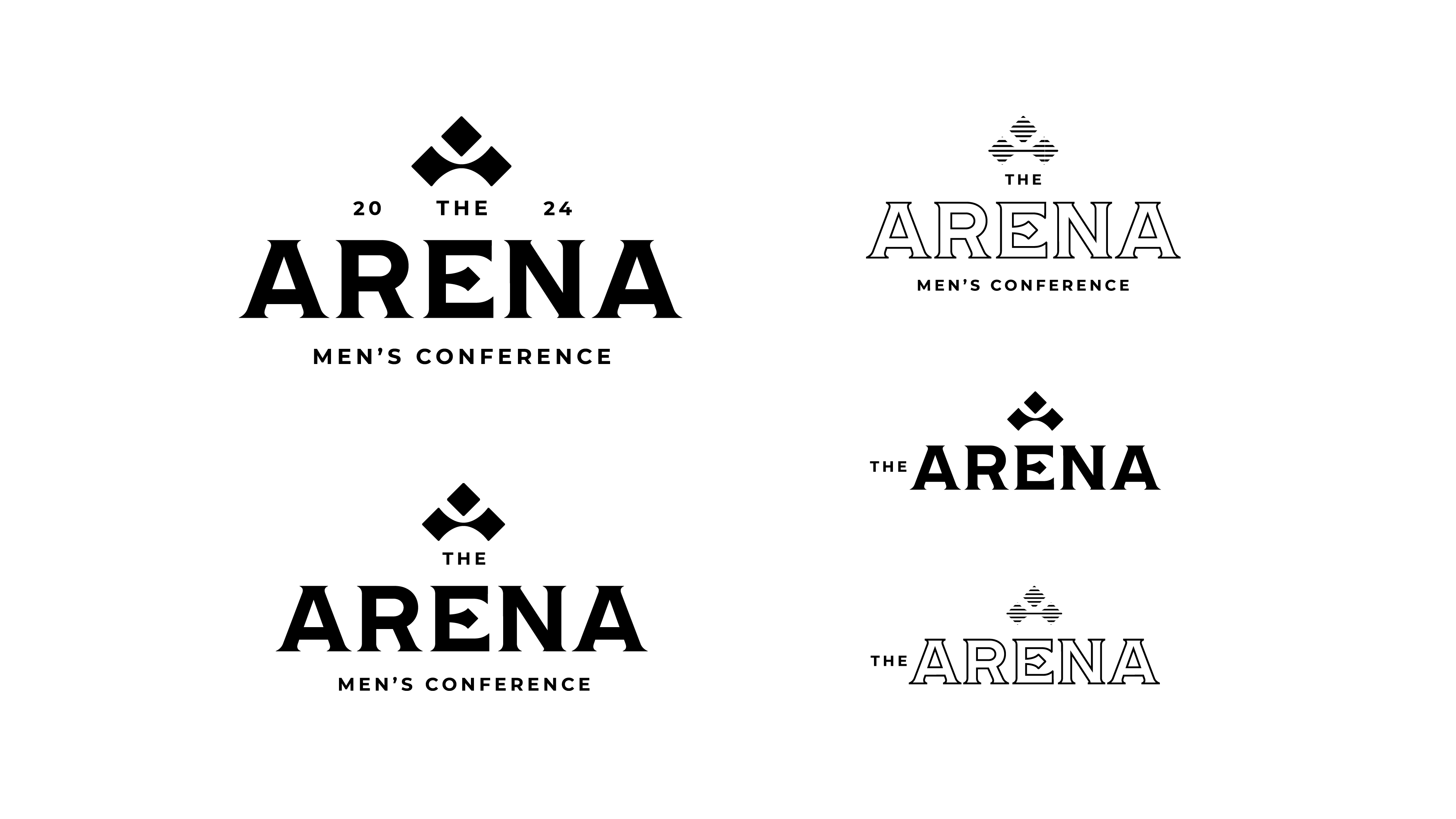
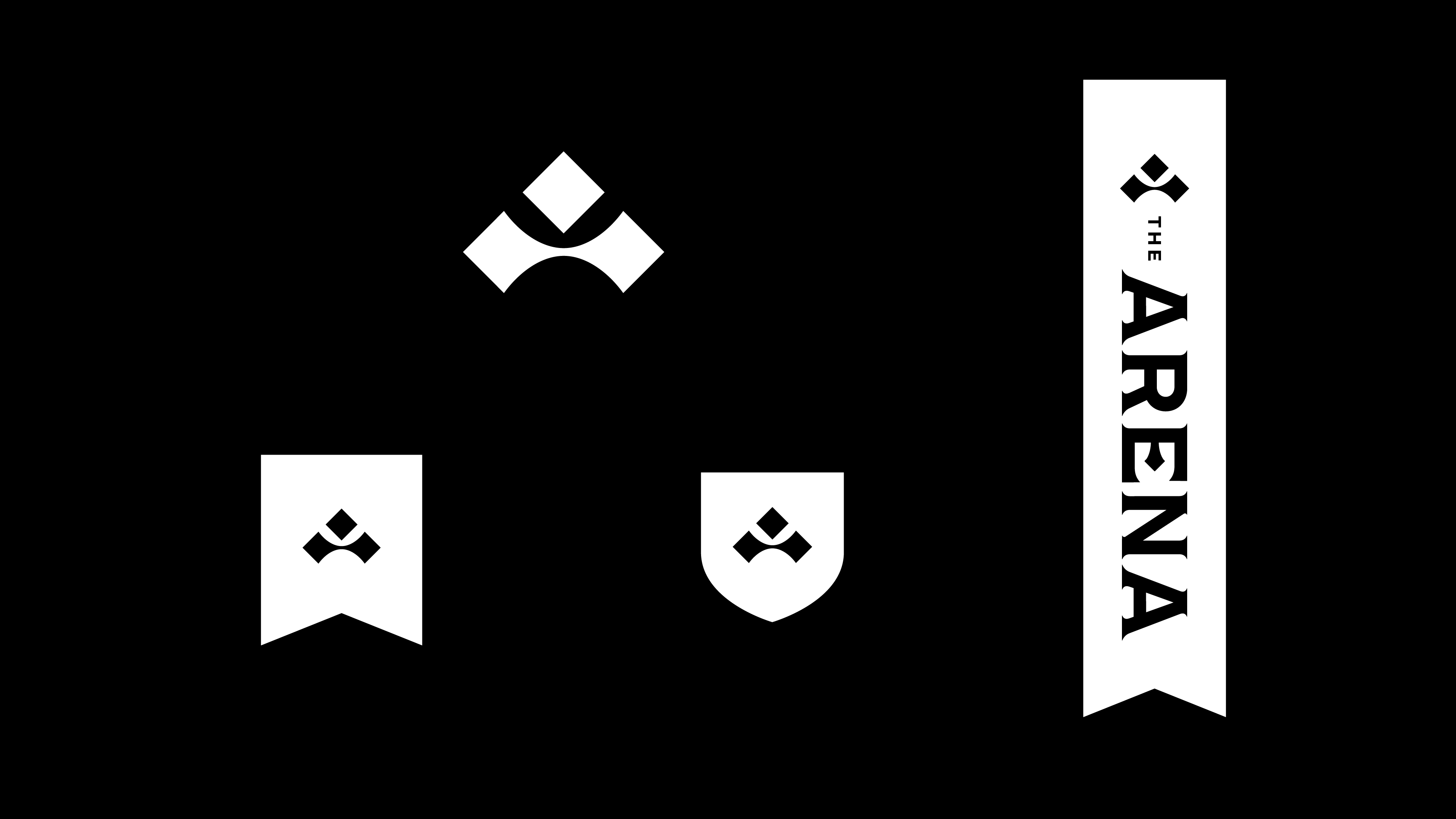
We chose a neutral color scheme to ensure adaptability across various conference themes. This versatility allows the brand to evolve with each year’s unique focus. The typography balances boldness with readability, emphasizing key messages without overwhelming the viewer.


Badge system
A flexible badge system rounds out the package, providing a way to highlight different aspects of the conference or recognize attendee achievements. This comprehensive branding solution equips The Arena with the visual tools it needs to stand out in a crowded field and connect with its audience year after year.
The Results
Today, The Arena is a cornerstone event in Evangel’s annual calendar. The conference‘s success has contributed to building a community of men committed to personal growth and faith development.
In the end, the new brand provided a solid foundation for the conference to grow and evolve, supporting its mission of fostering better husbands, fathers, friends, and followers of God. The Arena is no longer just a cool idea; it’s a can’t-miss event. In fact, the event garnered so much attention that it sold out! Arena has become the event where ordinary dads become everyday heroes, armed with faith, friendship, and a church that’s got their back.